Don’t limit your challenges.
Jerry Dunn
Challenge your limits.
Real Life Application #1

https://upload.wikimedia.org/wikipedia/commons/thumb/2/20/Uspop.svg/350px-Uspop.svg.png
Statistics can be very useful in our daily lives. One way in which it can be applied is in government agencies. These officials use statistics to plan, organize, interpret and present data in order to make decisions about economically related matters like population, health and education in a country. For example, they can indulge in research activities on population to calculate how rapidly the birth rate is growing in a certain region or they can also collect raw data from public schools regarding the pass & fail rates in a particular area. They can also see the proportion of males to females in a country or use a line graph to interpret & display the pattern of the death rate in a country due to seriously rising health issues that need to be taken care of immediately.
Real Life Application #2

https://www.answer-my-health-question.info/images/medical-error-statistics-5.jpg
Another way in which statistics can be applied to our day-to-day lives is in the science and medical field. Statistics make many areas of studies much more effective. For example, researching to see which medicines work best and how the human bodies react to treatment. Medical professionals also conduct studies in a variety of categories, e.g: by race, age, gender, nationality, etc. The graph above shows a country interpreting raw data about the cause and number of death.
Box and Whiskers Diagram
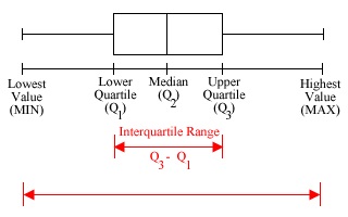
A box and whiskers diagram is a graphical method of displaying the median, quartiles, and extremes of a data set on a number line to show the distribution of the data. To draw a box and whiskers diagram, you will need to find the min, max, Q1, Q2 and Q3.
– min: the lowest value in your set of data
– max: the highest value in your set of data
– Q1: lower quartile, which can be found using the formula: 1/4 (n + 1) th, where n is the total number of data in your set of values. The answer will then give the position of where the lower quartile is located.
– Q2: median, which can be found using the formula: 1/2 (n + 1) th
– Q3: upper quartile, which can be found using the formula: 3/4 (n + 1) th.
Once you’ve found all this data, you simply draw a number line ranging from the min to the max. Then, you draw a small vertical line on top of the min and another vertical line on top of the max. Next, draw a longer vertical line in Q1, Q2 and Q3 and simply connect them using horizontal lines.
Scientific Calculator Instructions (fx – 991 ES plus)
1. To erase all the data on your calculator:
shift → 9 → all → = → AC
2. To put it on statistics mode:
mode → stat → A + Bx
3. To input data:
Simply put in your x values one by one then use the right arrow to move to the y column and in turn, input the y values. Once you’ve finished inputting all your data, press AC.
4. Shift 1:
This function can be used to recheck your data inputted by pressing shift 1 followed by the number 2. you can also find n, mean of x, mean of y, standard deviation of x and y simply by pressing shift 1 followed by the number 4. Next, you can find A and B in the equation A + Bx, as well as the correlation (r) by pressing the number 5 after shift 1.
5. 1 VAR:
This function is used when there’s only one variable of data (commonly either x or y) To do this, you should just press mode → stat → 1 VAR. Then, just input your data in the x column. If you want a frequency column as well, you can do that by pressing
shift → mode → stat → frequency on
